Design of a shopping app for orders to neighborhood stores near you
- My role
- User research, prototyping and UI design
- My role
- User research, prototyping and UI design

OneTwo App was a shopping application with a focus on local commerce. Through geolocation, users could find products in the nearest stores and reserve the purchase.
During the project, my role ranged from interface designer to user experience consulting. I was responsible for designing some interfaces, creating a new visual identity and elaborating strategies for validating the product with real users.
New Layout
During the MVP phase of the startup, the application screens had few patterns, confusing layout, and new features were created each week without any planning. The result was an interface that becomes more complicated and difficult to use at each iteration.
For this reason, my initial job was to standardize these interface elements to enable the expansion of functionality without compromising the user experience. Despite the different context, we followed an e-commerce model with some modifications in the categorization, product search, product page and logged area.
The layout was based on Material Design, with strategic modifications so that the usability in iOS devices was not compromised.
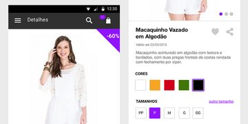
Product Page Development
The product page went through several iterations until it reached its final model. The initial goal was to connect seller and buyer through the offered product. After validating some hypotheses, we noticed that it was more effective to use this way of product visualization to bring more detail and its variations (sizes, colors, numbering, among others), besides we removed the direct contact with the seller through a chat, which would now appear after the act of reserving the product.
In addition, as the startup’s variety of products changed over time, this page should suit a growing category spectrum, not only clothes.
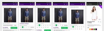
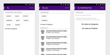
Categorization and search
Another reflection of the change in the product was the user’s search behavior. Updating the interface with autocomplete was essential to allow the consumer to find products and navigate more easily. As more categories emerged, an effective search became more and more the main functionality of the app.
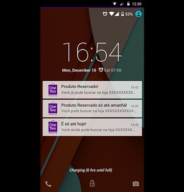
Notifications
With the updated product, search, and purchase order page, we’ve decided to renew the app’s notification rules. Because the app was based on asynchronous communication between consumer and store, a robust notification system became essential to mediate the exchange of messages between the two. In addition to the chat notifications, rules were created to remind the consumer to fetch the product reserved in the store, but with care and not to become an invasive app.
Usability Test
With these changes in the interface, we are concerned to validate the user’s understanding. In theory we had enough reason to believe that the interface worked, but we still needed to understand if, beyond comprehensible, the app solved customer and storeowner issues.
From there, I developed a usability test roadmap to be applied to potential customers in the MVP location by everyone from the startup.
Some screens


