Large-scale multivariate test on a landing page selling fiber internet services
- My role
- Managed of a team of 2. Creation of hypotheses and implementation of the experiment.
- Results
- Validation of hypotheses. Increased page conversion rate.
- My role
- Managed of a team of 2. Creation of hypotheses and implementation of the experiment.
- Results
- Validation of hypotheses. Increased page conversion rate.

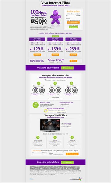
The Fiber product landing page was designed for the selling of high-speed internet plans in the city of São Paulo. Due to technical limitations, the web host was separated from the rest of the site (where the sales actually happen) and it had, at the time of this test, a large number of organic accesses daily or via marketing campaigns. This project was a series of A/B and multivariate tests for optimization of sales flow and here is described the process of the first Multivariate test carried out.
My role in this project was to manage the teams responsible for various aspects of the Landing Page (Marketing, Communication, UX and Metrics) to develop hypotheses, monitor implementation and test results.
Based on product history, pages, and performance reports, we’ve come up with some assumptions for users who gave up on the purchase on arrival:
Hypotheses
Product Value
In my humble opinion, there was a mistake in publicizing the campaign. The actual price to purchase the package was $ 129.90 since the fiber internet would never be sold separately. So, despite taking a lot of users to the store, let’s assume that the different amount caused a big sale in the next few steps. We expected the real value of the product to bring in less, but better-qualified, traffic to the store.

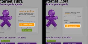
Sign-in Box Title
One of the suggestions of the responsible teams was that the title of the form Sign Online could hinder the flow of purchase, since in the next step users should still choose the package.
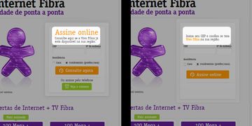
Sign-in Button Text
Again, for communication reasons, the button text was chosen to compare the performance of the two sentences. Consulte agora (See the plans now) was what actually happened in the next step: the user living in a region where the product is available would fall into a showcase of fiber internet products and others could only choose between inferior products. The term Assine online (Sign-in online) referred to the ease of purchasing the product (regardless of whether the user has this possibility in the next step)
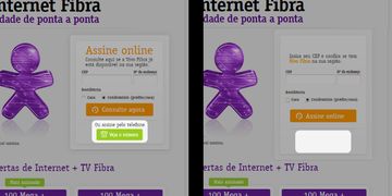
A final point of doubt for the teams was the suspicion that many users leave the page to buy via phone. With this variation, the goal was to find out if, in fact, the phone influenced conversions or not.
Multivariate Testing
Based on the above assumptions, we created an experiment in an A/B Test tool with 16 page variations. And we compare the result with the following metrics:
- Clicks on buttons with text Consulte agora
- Button clicks Veja o número
- Transactions
Results
- **Original conversion rate **— 9.2%
- Conversion rate of variation 10 — 10.07%
- p-value (related to coefficient of statistical validity) — 0.16
Validity coefficient is a type of statistical evidence used to infer criterion validity, either predictive or recurrent. In the case of researches with human behavior, it is common use a p-value of 0.05.
Despite the large number of hits, the test happened over a period of 3 weeks without reaching a conclusive result on which is the best variation for the conversions. However, the best-performing variation obtained a coefficient of statistical validity of approximately 84%. This led us to draw some conclusions:
- 8.6% improvement in conversion rate over Original — It may seem small but with this difference in conversion rate we can roughly predict the difference in the conversion rate of a page, and consequently , Change UX ROI in the interface.
- No correlation between the veja o número button and performance drop — We noticed that there was no relevant difference in the 8 variations in which we removed the interface button. That is, we suspect that users continue to flow independently from those who choose to call and finalize the transaction over the phone. Or, what users who buy by phone maintains this behavior independent of online subscription.
- Real price brought a smaller number of clicks and sale than expected — Our hypothesis has been rebutted. We note that, despite revealing the actual price of the package, users continued to buy at the same rate. The difference was that, by displaying the actual price at this step, more users gave up buying
- Removing the form’s title is correlated to a higher conversion rate — We were not sure why, but we found a correlation between the absence of the title in the form and increase in the overall conversion rate.
Conclusion
Multivariate tests are difficult even when performed on a large scale. Small variations in the interface are not enough to validate the hypotheses quantitatively, and in a company where Landing Page are extremely dynamic in relation to product changes, it is very difficult to follow the test rigorously.
With this in mind, A/B and multivariate tests are a great tool for generating learning about the user. Many details need to be interpreted, but in my opinion, in existing products with large numbers of users, this method is perfect for understanding the behavior and improving the experience in a short period of time.
Winning Variation