Salary advance app design that has reached over 40k active customers
- My role
- User research, prototyping and UI design. Management of 2 designers. Responsible for the product vision.
- Results
- 5 ⭐️ rating app in app stores. Decreased default rate. Improved the service profitability.
- My role
- User research, prototyping and UI design. Management of 2 designers. Responsible for the product vision.
- Results
- 5 ⭐️ rating app in app stores. Decreased default rate. Improved the service profitability.

Objective
Facio was a financial well-being company that served the B2B2C market. Since late 2020, they decided to investigate the possibility of pivoting its main product: salary advance for the B2C market. This is the story of that product.
Understanding the differences in markets, creating a useful, accessible, and usable product for Brazilian workers was the main challenge.
There were also two main design restrictions at the beginning:
- Since the product was open to the general public, a credit analysis would be conducted to identify who would be eligible to use it.
- The salary advance payment, which used to be deducted from the payslip, would now be made via automatic debit.
Process
We worked in product teams using the Continuous Discovery methodology most of the time. We investigated customer needs weekly, created opportunity trees to structure the needs of those who used the product, and collaboratively explored problems, created solutions, and validated hypotheses through experiments.
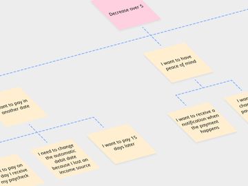
The opportunity tree is a great way to structure research findings
Live data prototype with automatic debit
At the beginning, we conducted several usability and value experiments to identify an interesting product for the target audience.
We found that the demand was high, and additional services did not make much difference. With this in mind, the first functional version of the service was launched, with the most basic features of the same B2B2C service we decided to discontinue.
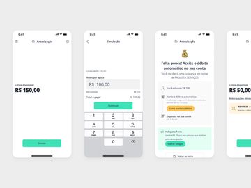
In the first version, to receive the salary advance, the customer had to prove that they accepted the automatic debit in their bank
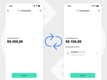
The salary advance limit is ephemeral. When the customer pays, they return to their initial state
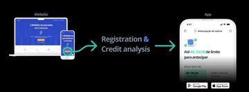
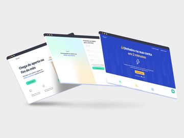
To hire the product, the customer must register on the website (on their smartphone, tablet, or computer) and go through a credit analysis.
Those who are eligible can download the application from the Google Play Store or the App Store. It is also possible to log in to the site and use the web interface to perform transactions.
Acquisition experiments
A common practice throughout the product’s history was to use the product homepage to conduct experiments in the form of A/B tests.
We tested ideas such as more transparent communication, informing limit values, and detailing the registration process. Also, for each change in the product rules, we conducted A/B tests to investigate the impact on service hiring behavior.
A high volume of access in A/B tests helps us to have consistent answers to our hypotheses
Referral program
After some experiments, we discovered impressive potential when we decided to reward new referrals from existing customers.
One of the experiments in this channel was to propose a reward that gradually increases according to the number of referrals.
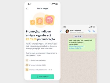
The main way to refer friends was through WhatsApp. We noticed in our research that people referred family and acquaintances from their workplace
Investigating the journey
With continuous growth, new features increased the product’s complexity. We then decided to investigate the journey of those who use the Facio salary advance service.
Journey of new salary advance customers
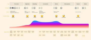
Although customers constantly praised the product, at various times, the experience fell short, bringing new opportunities
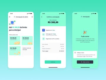
Transaction status
The main difference from the B2B product was the possible default. Before, all microcredit service customers paid via payroll deduction. Now payment depended on a customer’s action.
Being transparent has always been a company objective. Therefore, when becoming default, the customer has access to the status of their transaction, as well as possible benefits for payment (discounts and installment payments) or penalties (fine, interest, and negativation).
When someone requests an advance, the detailed status is available in the app
Notifications and communication
For the same reason, we invest in communicating the status of each transaction in the best possible way, whether through smartphone notifications, in-app notifications, or even WhatsApp.
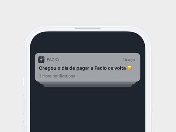
Communicating in a simple, accessible, and friendly manner was important to the company, even in difficult communications such as late payments or negative credit services
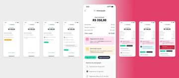
Offering an additional limit
Credit policies are constantly changing, and for many customers, the initial limit was not enough to meet their needs. Therefore, we decided to offer an additional limit for good payers.
As it was an experiment, the offer appeared as a modal on the transaction confirmation screen.
We observed a positive change in the behavior of these customers, but at the same time, we encountered a serious usability problem.
Discoverability
The problem with this interface was the ability of new customers to discover the functionality. Therefore, we switched from a customized value to fixed offers.
In this interface, customers take 31% less time to complete a transaction and make 65% fewer errors.
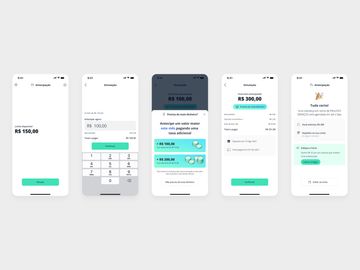
The additional offer has fostered customer loyalty, but many people had doubts or did not even know that it was possible to anticipate a larger amount
The new interface solved the usability problem while maintaining the interesting limit offer
Results
The product has grown exponentially over the past few years, with positive feedback from customers:
- 5.0 rating in app stores
- 40,000+ active customers
- 100,000+ downloads
- R$ 20,000,000+ borrowed
Role
I was the lead researcher and interaction designer for this project, working from the initial conception, research, experiments, and interface design for the service across various channels.